Summary
This week had a lot of very technical content around the concepts of corrections, merging images and enhancement. Honestly, a bit overwhelming at first. The good news is that a lot of the methods covered this week are automated, when using tools like Google Earth Engine. Therefore, for me it is important to understand the broad concepts rather than how each method is exactly implemented. To this end, the table below provides short explanations for some of the concepts of this week. I used the lecture slides, the practical content, Michael Hathorn’s Learning Diary, and Chat GPT to compile this table.
Warning: package 'kableExtra' was built under R version 4.3.2
| Geometric Correction |
Remote sensing data often has image distortion issues due to the angle its taken from (e.g., off-nadir means not directly down), the topography, or the rotation of the earth. This can be fixed by taking Ground Control Points (GPS) and matching them with known points in the image and a reference dataset (goldstandard, where we know its corrrect) using different algorithms. |
| Atmospheric Correction |
Absorption and scattering create atmospheric haze and makes pixels bleed into one another. It makes the image less clear (less contrast). There are two sources of environmental attenuation: Atmospheric scattering and topographic attenuation. |
| Orthorectification Correction |
Georectification means giving coordinates to an image. Orthorectification means removing distortions by making the pixels viewed at nadir. |
| Dark Object Subtraction (DOS) |
Method to correct for atmospheric effects and sensor-specific artifacts. In DOS, the darkest objects in an image, such as shadows or non-reflective surfaces, are identified and assumed to represent the true "dark" or background signal. The pixel values of these dark objects are then subtracted from the entire image, effectively normalizing the data and reducing atmospheric influence. DOS helps enhance the contrast and accuracy of satellite imagery, particularly in areas with varying atmospheric conditions or topography. |
| Digital Number (DN) |
The raw number that the sensor stores, or the value that the sensor "sees" (no unit). |
| Radiance |
Radiance is derived from DN. DN to spectral radiance = radiometric calibration. It refers to the electromagnetic radiation emitted or reflected from the Earth's surface and recorded by the sensors/satellites (e.g., light reflected from a tree). It represents the intensity of radiation across different wavelengths or spectral bands. Is used as a measurement for understanding different materials on the earth surface (e.g., vegitation). Also called Top Of the Atmosphere Reflectance. |
| Surface Reflectance |
Radiance after correction for atmospheric effects. Also called Bottom of Atmosphere Reflectance. |
| Collection, level and Tier |
Collection, Level and Tier help us decide what remote sensing data product to choose, when downloading data. Collection comes in 1 and 2 with a difference in how the data was collected. We always use 2 because it is the latest release. Levels refer to the quality of data and also comes in 1 and 2, where 1 = DN and 2=surface rediance. Tier refers to the quality of data, where 1 is the highest. So going forward, we usually use: Collection=2 Level=2 Tier=1 |
| Ratio |
Ratio enhancements use the different spectral signatures of different materials in spectral bands to exaggerate specific features. NDVI uses red and near-infrared spectral bands to draw out healthy vegetation, because healthy vegetation reflects highly in the near infrared wavelength and is absorbed in the red red one. Areas with a high NDVI index represent healthy vegetation. NDVI=NIR+Red/NIR−Red |
| Texture |
Essentially, it’s a measure of each pixel’s similarity (or difference) to the pixels around it. For example, the image below shows homogeneity for Cape Town. It’s calculated using a grey-level co-occurrence matrix (GLCM). This involves creating a matrix for all pixels and their neighbours in an image, and calculating how homogeneous (similar) each pixel is to its neighbours. In the image below, areas with high homogeneity (the ocean, stretches of agricultural land in the north) are white, while areas with significant contrast (such as the coastline) are dark, due to the high contrast between the ocean and beaches. |
| Data Fusion |
Data fusion in remote sensing refers to combining information from multiple sources or sensors to enhance understanding of the Earth's surface. This integration improves data quality and utility by leveraging the strengths of each source while compensating for their individual limitations. Techniques include merging spatial, spectral, and temporal data to create more detailed and accurate representations of land cover, environmental changes, and other phenomena. Data fusion enables better-informed decision-making in applications such as land management, disaster response, and environmental monitoring. |
| Principal Component Analysis (PCA) |
PCA is a statistical technique used for dimensionality reduction and feature extraction from multispectral or hyperspectral imagery. By transforming the original spectral bands into a smaller set of uncorrelated variables called principal components, PCA simplifies analysis tasks and aids in data compression. These components capture different aspects of variability in the imagery, such as brightness, texture, or spectral signatures, facilitating efficient storage, noise reduction, and visualization of remote sensing data. |
Application
This week, I explore an application area of remote sensing that I have always been interested in: mapping informal settlements in cities. I wanted to see, if I come across some of the concepts described above, reading through the studies.
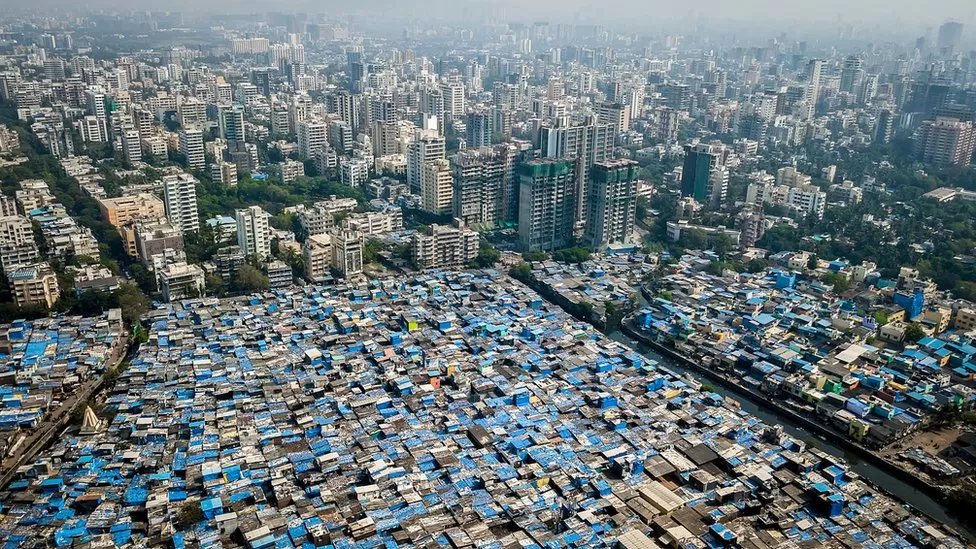
Informal settlements are often the most vulnerable parts of cities. They tend to be located in areas that are extremely vulnerable to the effects of climate change, such as flooding or heat and lack basic urban services, such as sanitation infrastructure or public transport. Makeshift houses leave residents exposed to the elements, and provide little protection against intruders. Many people living in informal settlements lack security of tenure and are under constant threat of eviction. What may look like temporary neighborhoods often remain for decades. One of the most famous examples, is Dharavi in Mumbai. Dharavi is one of the largest informal settlements in the world right in the center of Mumbai.
I looked into a few studies that use remote sensing to map informal settlements and turns out its “a mammoth task due to the spatial heterogeneity of urban landscape components, requiring complex analytically processes.” (Matarira, Mutanga, and Naidu 2022)
It seems that many studies use Very High Resolution (VHR) and High Resolution (HR) satellite imagery. Such data sets are expensive and therefore not accessible for local governments, especially in low and middle income countries, where most informal settlements are. (Matarira, Mutanga, and Naidu 2022) More recently, researchers tried to find methods to work with openly available data sets such as Sentinel or Landsat to identify informal settlements.
Matarira, Mutanga, and Naidu (2022) map informal settlements in Durban South Africa. The paper investigates different data input combinations in order to find the one that presents most accurate and reliable findings.The study uses Google Earth Engine to process Sentinel 2 images of the city of Durban integrating spectral and textural features in order to understand the extent and location of informal settlements. Texture is used in this instance to better distinguish different types of built up areas from other land cover types. The study found that a classification based on spectral bands and textural information has the highest accuracy. It was able to detect informal settlements with a 80% accuracy. They also deploy data fusion. A composite was formed based on 3 images with low cloud cover and a median value calculated for each pixel. The resulting image was used for processing.
The method for processing used was pretty complex and I didn’t understand it fully. Classification will be covered later from week 6 onward. I still summarized the key steps below, which I found useful as it gave me a rough understanding of the workflow and effort of such an analysis. Broad steps of the method listed below:
- Select images with low cloud cover, calculate the median for each pixel to form a composite image used for processing.
- Extraction of spectral and texture features from different bands,
- Establishing different combinations of these feature types to be tested,
- Use a Random Forest Classification using GEE,
- Assessment of the classifier’s accuracy.
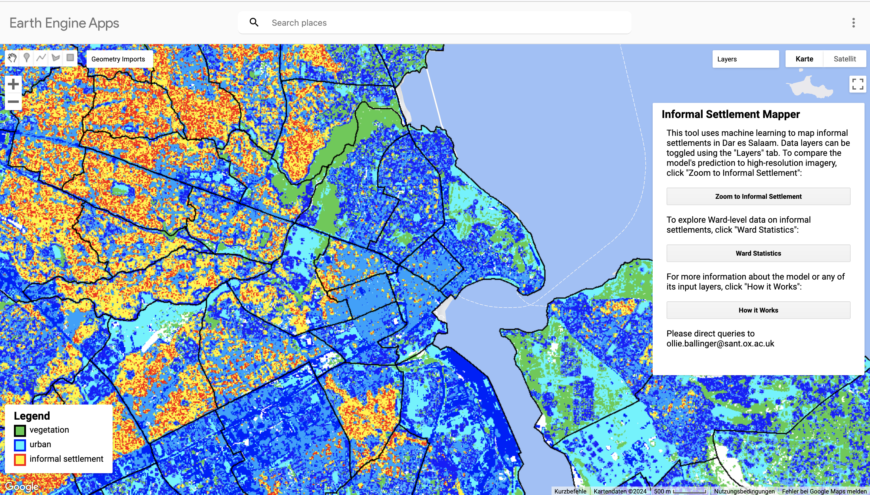
It is great that the data used in this study is free. However, it still does not seem very accessible to a local government in a LMIC because technical capabilities to procure, let alone conduct such a study seems immense. It would be great if there was a spatial application that allowed city governments to map informal areas in their city in an automated way. Ollie Ballinger actually managed to built an interesting Google Earth Engine Application to map informal settlements in Dar es Salam in Tanzania. It is different to the approach taken in Durban because he removes the formal buildings and than applies classification only on the remaining areas. (Ollie Ballinger 2024)
Reflection
The lecture and practical content this week was a little painful, both for me (difficult concepts) and my laptop (computational power needed for working with remote sensing data). I made it even harder by choosing a difficult topic to explore for the learning diary.
However, i got excited to get started on Google Earth Engine, where a lot of these processes are automated and run on a cloud. It sounds like that makes it easier to focus on the analysis and get to the fun and interesting bits more quickly, rather than spending a long time making corrections and enhancements to the data. Thank you Google…
I was not aware how difficult it is to map informal settlements with remote sensing data. I actually assumed it would be one of the easier methods as it is so well known. I can’t say that I completely understood the method used in Durban. However, it was still a worth wile exercise for me because it gave me a better idea of the workflow for remote sensing. I will keep going back to the topic of informal settlement detection as we go through the term to understand better as we cover more ground on more remote sensing concepts.
Matarira, Dadirai, Onisimo Mutanga, and Maheshvari Naidu. 2022.
“Google Earth Engine for Informal Settlement Mapping: A Random Forest Classification Using Spectral and Textural Information.” Remote Sensing 14 (20, 20): 5130.
https://doi.org/10.3390/rs14205130.